World Press Photo Mock up
2025 - Figma.
As part of an information architecture and mockup exercise, I developed a prototype for the World Press Photo mobile application with the goal of creating an intuitive, accessible, and efficient user experience. The design focuses on simplifying navigation and organizing content effectively, based on a flowchart developed in earlier stages of the project. This structure was informed by prior user research, including a card sorting activity conducted with relevant users to ensure alignment with their mental models. The result is a system that applies core principles of information architecture, enabling users to quickly access key sections such as their profile, visual exploration tools, and educational resources. I prioritized ease of use by incorporating familiar interface elements like a hamburger menu, bottom navigation bar, and shortcut access to frequently used features. Additionally, the prototype addresses the diverse needs of identified user personas by including functionality tailored to their interests, such as educational content, visual exploration, and account customization. Overall, this prototype represents a user-centered solution that supports clear information organization and fluid navigation, grounded in both research and design best practices.
Creative Process
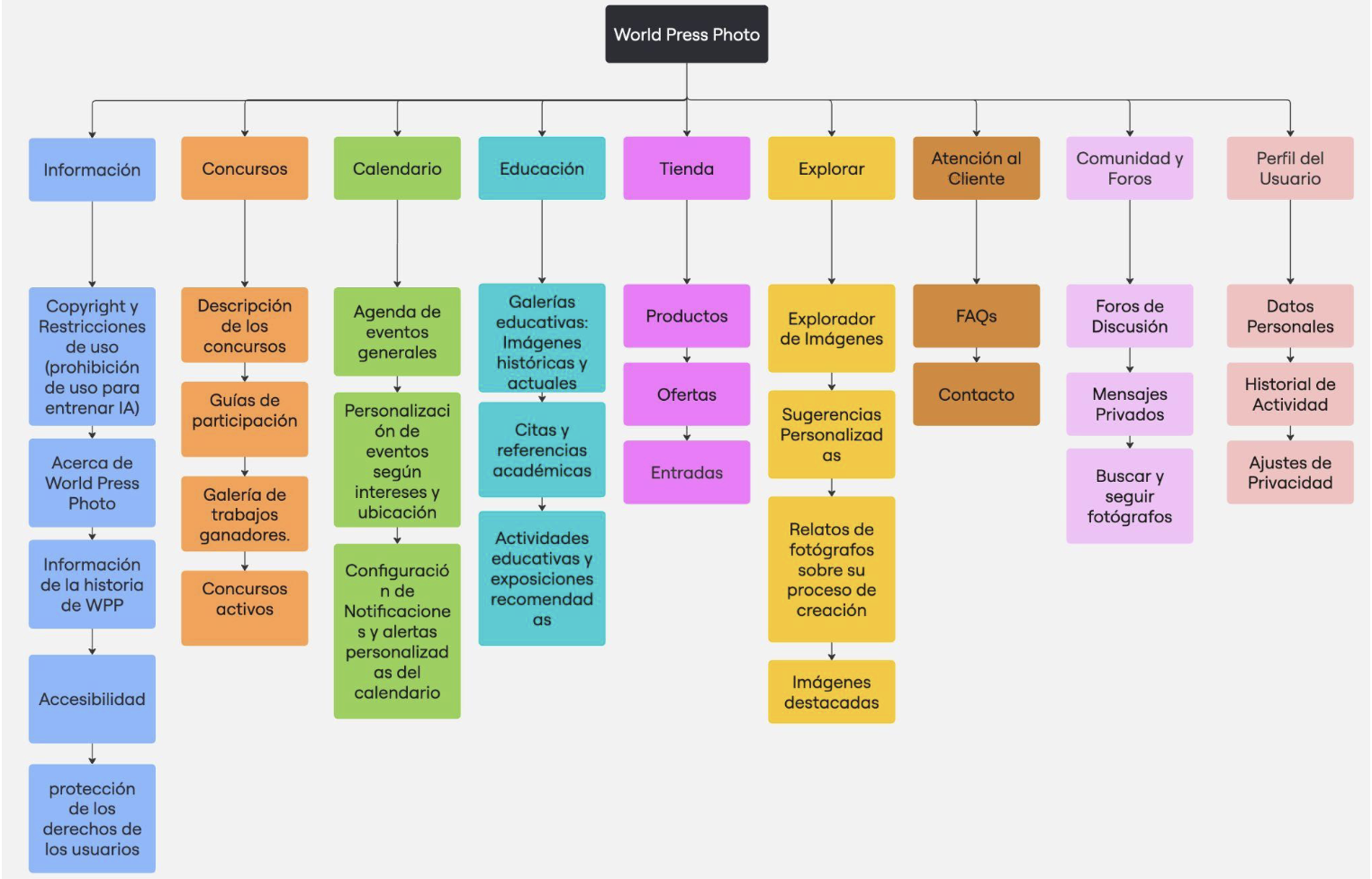
The prototype we developed aims to provide an intuitive, accessible, and efficient user experience for the World Press Photo application. Focused on simplifying navigation and organization, we designed a content system based on the flowchart created in earlier activities, informed by a prior study using card sorting with relevant users.
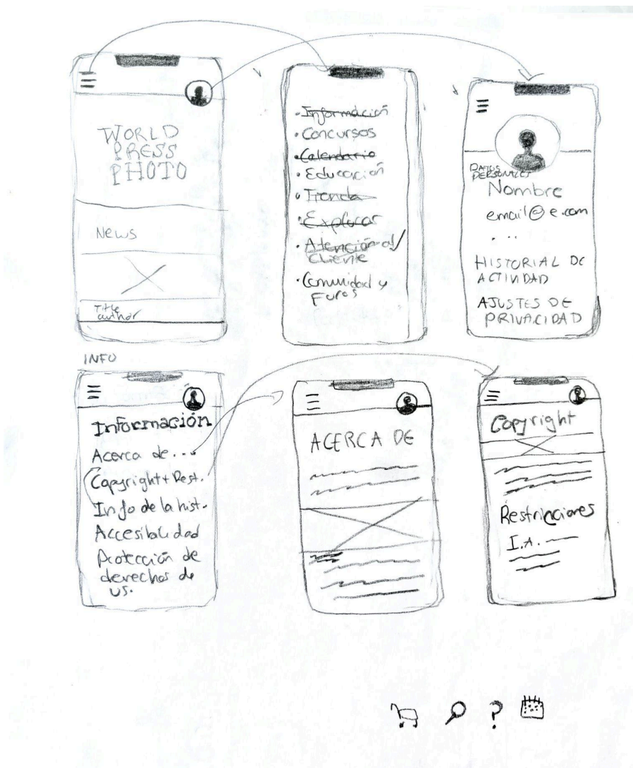
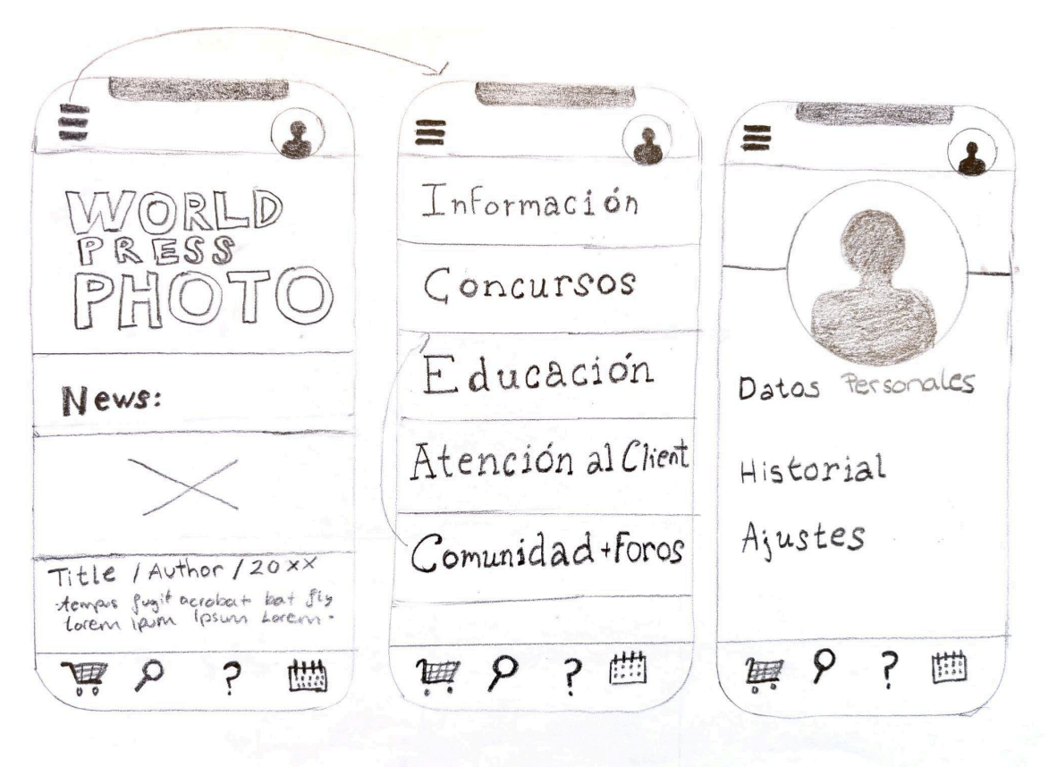
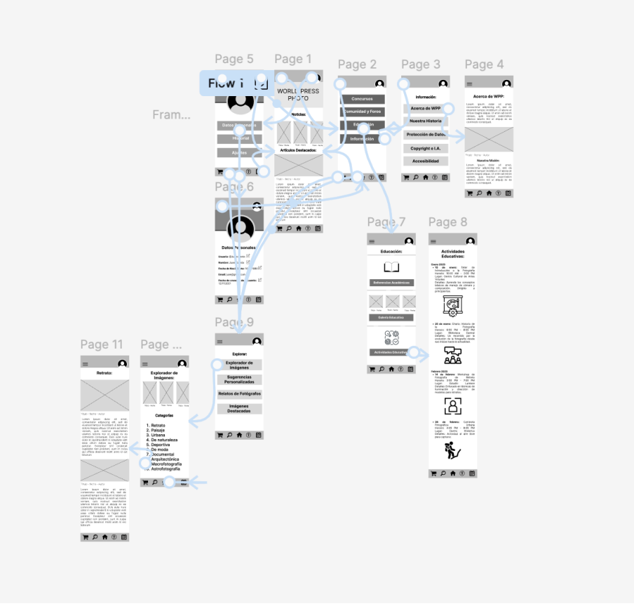
The project’s conceptualization began with an initial sketch that marked the first approach to the design. This sketch did not yet include the bottom navigation bar—later added with sections for Store, Explore, Customer Support, and Calendar—but it did show the first icon concepts for the bar in the lower-right corner. The bar was introduced to simplify the hamburger menu seen in the second screen. Based on this sketch, some menus were reordered and labels simplified to create a more intuitive experience. Additionally, profile access was placed in the upper-right corner to further streamline navigation.
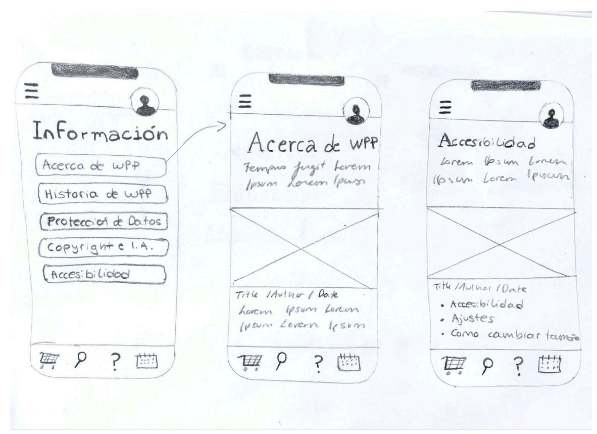
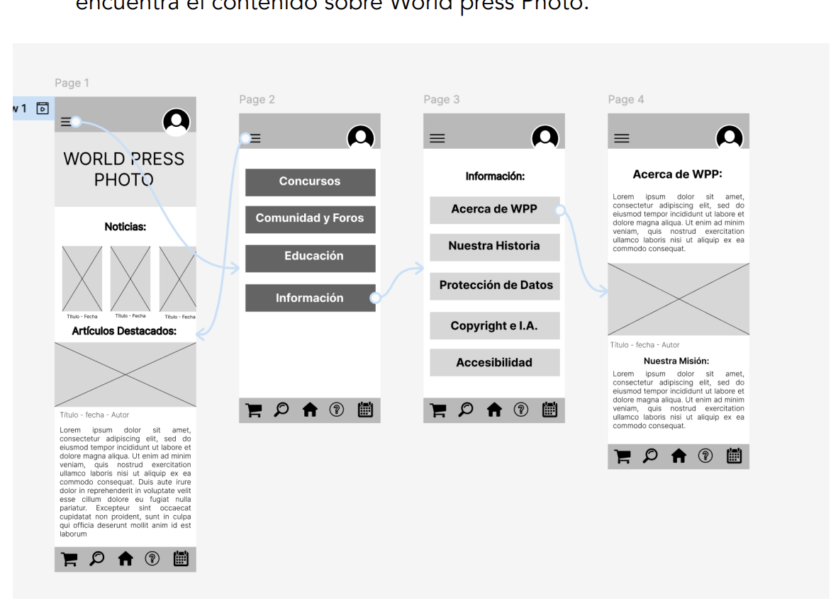
These screens show the “Information” section, accessed through the hamburger menu, which includes pages such as “About WPP” and “Accessibility.” Both subcategories share a similar design, a format that could be applied consistently across all hamburger menu subcategories. As noted earlier, the “Home” icon is still missing from the bottom navigation bar in this sketch.
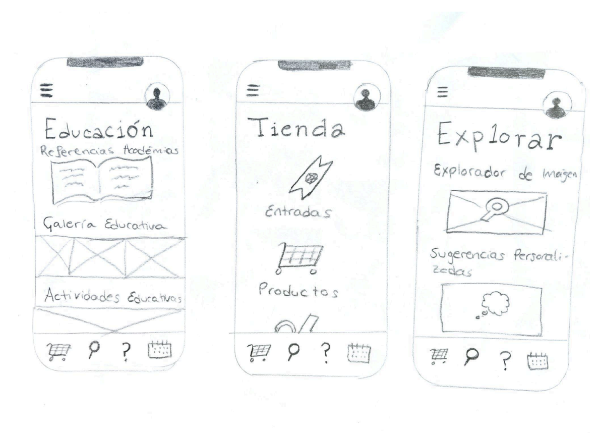
These three screens show the “Education” section (accessed via the hamburger menu), the “Store” section (via the cart icon in the bottom bar), and the “Explore” section (accessed similarly). As before, the “Home” icon is still missing from the bottom bar. Otherwise, this concludes the first phase of project conceptualization, which—along with these notes—will serve as a reference for the next prototyping phase.
This analysis aims to optimize navigation and ensure a smooth, intuitive user experience.
The user starts on the homepage.
They open the hamburger menu (three lines, top left).
They select Information.
They choose About WPP.
The system redirects to the About WPP page with World Press Photo content.
This flow can serve as a model for similar navigation processes.
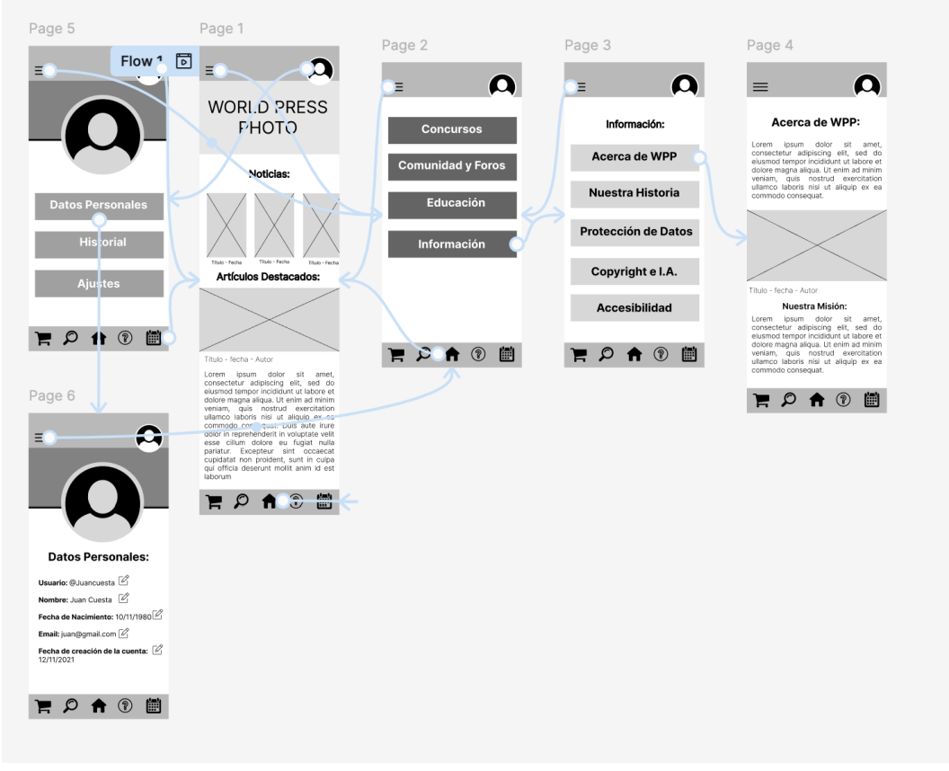
This flow focuses on accessing the Personal Data section via the profile button, aiming to make the experience intuitive and efficient.
The user starts on the homepage or any page where the profile button is available.
They locate the profile button (user icon) in the top right corner.
The user selects the profile button, which opens a menu with account options.
From the menu, they choose Personal Data.
The system redirects them to the section where they can view, edit, and update their personal information.
This flow ensures clear access to personal data and promotes effective interaction with the system.
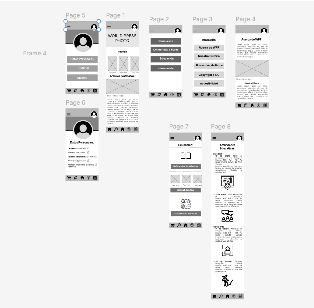
This flow focuses on accessing Educational Activities through the Education section in the hamburger menu. Its goal is to align with user needs defined in the User Journeys and help them easily find educational resources.
The user starts on the homepage or any page of the site.
They open the hamburger menu (three horizontal lines, top left).
Inside the menu, they select Education to access its subcategories.
Within the Education section, they choose Educational Activities.
The system redirects them to a page listing available educational activities, including workshops, courses, and resources.
This flow ensures users can easily find activities that match their interests, enhancing their experience within the defined User Journeys.
This flow guides users from the Discover button at the bottom of the interface to the Image Explorer. Its goal is to create an intuitive, visually engaging experience that inspires exploration.
The user starts on any page where the Discover button is visible at the bottom.
They locate the Discover button, represented by a magnifying glass icon.
When selected, it leads the user to the Image Explorer page.
The system displays the Image Explorer with photographs organized in categories and a gallery layout.
The user browses the available categories and selects one to see details, including descriptions, photos, and authors.
This flow is designed to spark curiosity, enable smooth visual exploration, and provide seamless access to image resources.